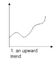
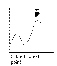
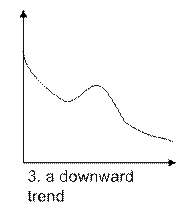
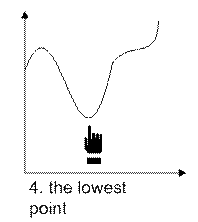
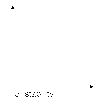
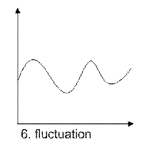
Exercise 4.10. To describe Movements and Trends you should use different verb forms. Underline the correct verb form in the following sentences.
1 Temperatures in some parts of Britain fell / fall / has fallen between 2015 and 2016.
2 Usage of energy that comes from coal, oil and gas was increasing/has increased/increased rapidly during the summer months last year.
3 Amounts of carbon dioxide into atmosphere rise/have risen/are rising since 2009.
4 The political tension has deteriorated / deteriorate / had deteriorated into civil war this month.
5 Production of personal computers had already improved / are improving / improve when we introduced the new product line in 2010.
6 The number of motor vehicles fluctuate / had been fluctuating / were fluctuating before we streamlined the processes.
7 This work improves/ is improving/has improved now.
8 Soils where rainforests grow are getting/ get/have gotten worse and worse.
9 Sales of personal computers pick up/had been picked up/ will pick up next year.
10 Unfortunately considered problems won’t improve/don’t improve/had not improved in the foreseeable future.
Exercise 4.11. Read the text about Some Tips to Describe Trends on Graphs and Charts.
v Think about the number of visuals you want to use – don’t overdo it! Remember: less is often more.
v Before showing the graph or chart, prepare the audience for it. Say something which makes them interested in what they will see. This technique is called “media teasing”.
v Give the audience time to understand what they see before you start explaining the details.
v If the movement you want to describe is very complex, simplify it. Divide the graph into two or three parts and summarize the main developments.
v Provide an interpretation of the graph’s movement. The audience wants to know there are ups and downs in the graphs, what they mean, and what consequences they have.
v Use the TTT method when presenting graphics: touch (or point to) a detail on the projection, then turn to the audience, and finally talk to them.
v Use interesting and varied language to describe trends. You need alternative expressions to describe similar developments.
· Which tips do you think are the most useful? Why?
Read & Reflect
| Useful Information Checklist for Visuals Ø Prepare each visual carefully and separately Ø Check whether the visual really shows what you are saying. Ø Make sure your audience can read the visual (font size and color). Ø Find effective headlines. Ø Keep design and content simple. Ø Use bullet charts for text. Ø Reduce text to a minimum. Ø Always prepare audience for visuals. Ø Present information clearly and logically Ø Remember the rule of six. Checklist for Using Visuals (Graphs & Charts) Ø Make your visual as clear and easy to understand as possible. Ø Start by telling your audience what the graph / chart illustrates. Ø Highlight the key points. Ø Say why these points are important (and explain the cause or effect). Ø Use different verbs to express movement / development. Ø Use the same key words and phrases you used on your bullet charts. |
UNIT 5. To Sum Up…
Connect to Your Life
In pairs, discuss the following question:
· What advice would you give someone who has to make the conclusion of a presentation more effective?
Exercise 5.1. You can make your conclusion more effective using questions, quoting a well-known person, referring back to the beginning or calling the audience to action. Look at the sentences and put them in the correct category in the table.
1 Remember what I said at the beginning of my talk today? Well, …
2 So that’s the plan. Now let’s go and put it into practice!
3 As … once said, …
4 After all, isn’t that why we’re here?
5 Now let’s make a real effort to achieve this goal!
6 Let me just finish with a question: If we don’t do it, won’t somebody else?
7 To put in the words of …
8 Let me just go back to the story I told you earlier. Remember, …
| Using questions | Referring back to the beginning |
| Quoting a well-known person | Calling the audience to action |
Дата: 2019-03-05, просмотров: 645.